I was asked to make a duffle bag for a special order and since I am on my crazy pattern improvement kick, the duffle pattern was calling my name. This bag is going to hard to put in the mail- I would like to keep it for myself!
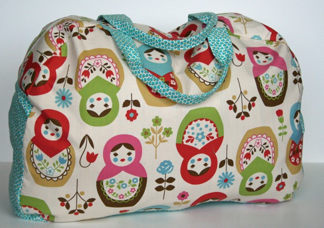
Ignore those threads hanging off the handle!! She saw my new notebook slipcover title and wanted the matroyska fabric (joel dewberry has arrived and is safe on my shelf so no more FFHD!) As for the duffle pattern, I had heard that the quilted piece on the bottom might be too long and I knew this would be an opportunity to get it worked out finally.
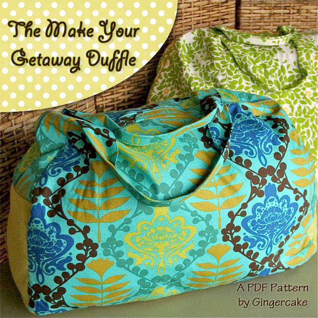
Things are not all that different in this pattern but I thought you might want to hear a bit about what programs I am using to make these changes. A big part of doing all this pattern updating is that now I have better software programs to write the patterns and create my graphics.
I was using Word and I purchased Pages from the itunes store back in May for only $19.99. It's the Macintosh presentation software and It is such a wonderful and easy program. The layout is simple (yeah for me!) and flexible. To write out a pattern, you need to be able to move around the pictures, create textboxes on top of those pictures, change colors, etc. I don't use any of their templates- I just start with a blank page, move the margins out to .5" and begin writing. I like the white space and feel like all the templates are distracting. Pages has been a big help to simplify my pattern writing.
The other software that has been such a help has been Photoshop elements. I spent about $80 which was a little hard for me to justify at first since I had a hard time getting started on the program. I am not going to say it has been the easiest program to learn but it has been really really good for my skills. The challenge and frustration have been well worth it since now I love it and it makes my pictures so much better. I thought I would share my favorite uses for this program.
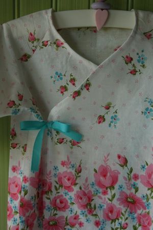
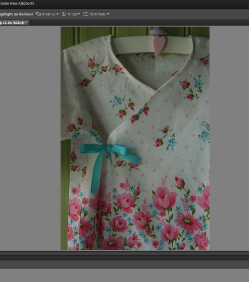
First, I drag my dark picture taken by the camera (with no flash) out of iphoto and right into PSE.
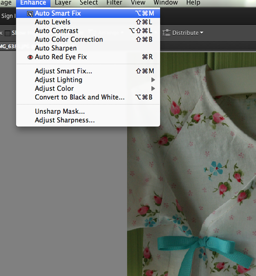
Then I use the auto smart fix option under the enhance bar.
Next I lighten the photo up further by going to the "levels" section…
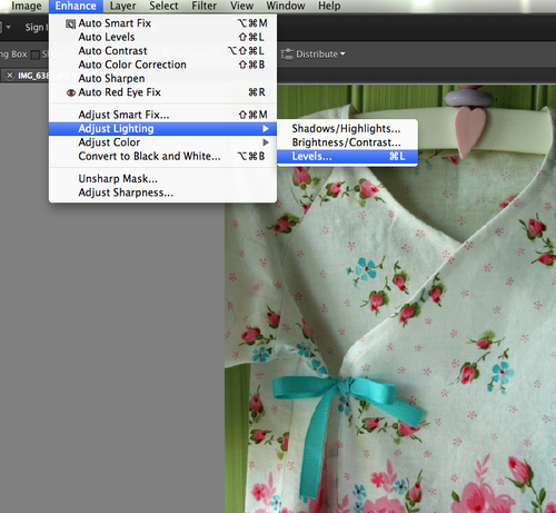
Levels has been an awesome discovery! When I made these notebook covers for AnnKelle, Kelle Boyd took my pictures and made them even brighter for her blog– brighter but not false looking. When I asked how she did it, she told me about levels!
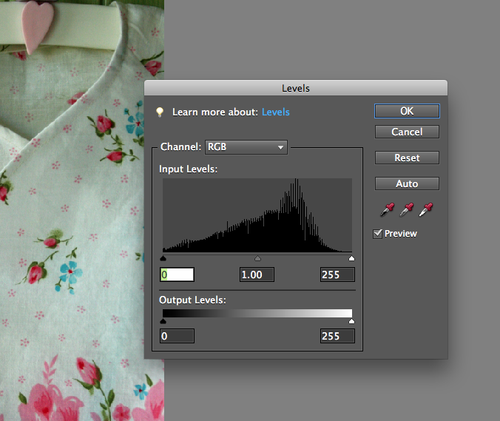
See the mountain up there? You want to click on the middle triangle under the mountain and move it left of center.
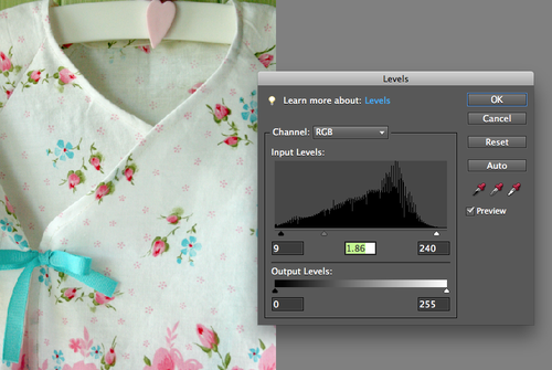
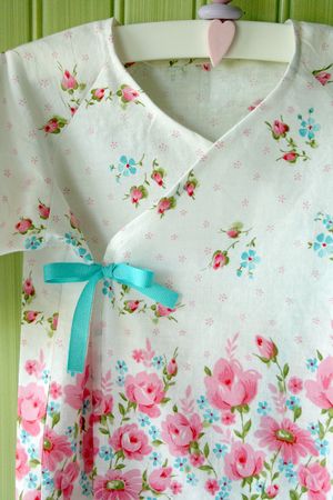
See? Bright but not false! Finally, I usually sharpen the photo with the auto sharpen so the stitches show up a little better .
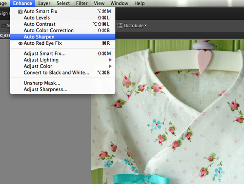
Then I save the final product right back into Iphoto or onto my desktop. See the difference? Amazing and natural looking!
More about this sweet baby shirt here. I am no expert, but this is what is working for me right now!
With these methods I was able to go back into my old patterns and take some of the dark pictures from my sewing room and really lighten them up. I feel like it is really important for the instruction pictures to be as clear as possible.
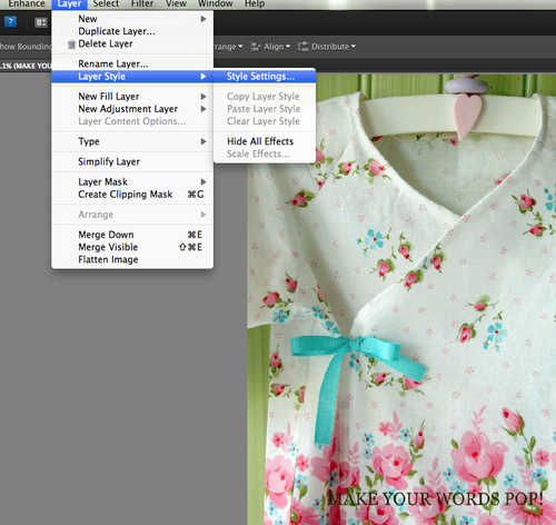
If I am making a new title, I stay in PSE and I like to fool around with making my text really stand out. I type out whatever little phrase I can think of to describe my project and it usually looks dark and insignificant.
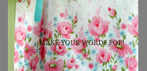
I go into layer style to fix them up.
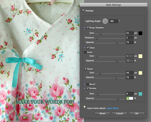
Style settings opens into this handy box…
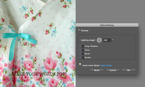
I begin by adding a drop shadow and then add the outer glow. You can move the circles around to adjust it to look how you would like.
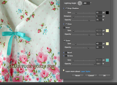
Sometimes this is enough but if I want to get cutesy (and I usually do) I add stroke also…
I get most of my graphics from Pugly Pixel and Fuzzimo. Pugly Pixel is a wonderful source for graphics information and she offers membership levels tha are really affordable plus, many of her items are free or you can just buy individual items. I bought her paper collection and I have used it over and over to create shapes and titles.
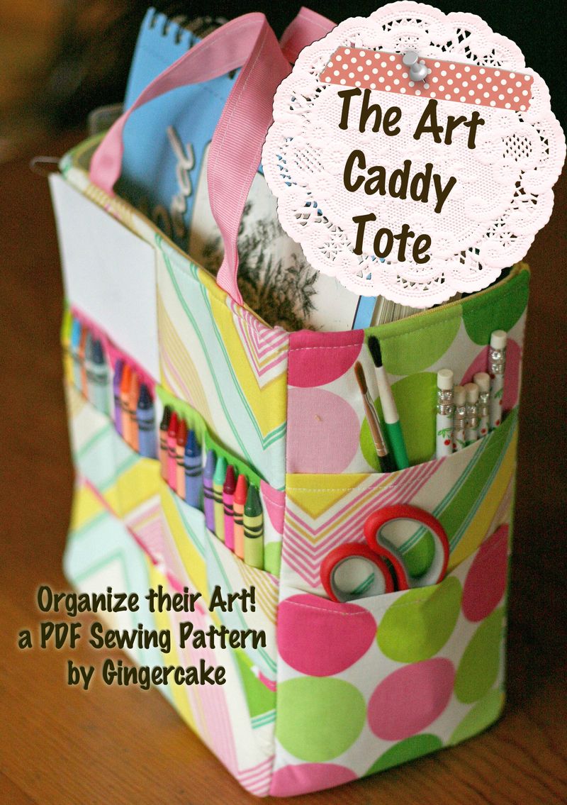
Fuzzimo also offers lots of cool graphics and all for free- including zippers, scrabble tiles, safety pins, and the push pin I used in the new art caddy title below. The doily is from pugly pixel and so is the tape strip.
It has taken me awhile to work out these good programs and now I feel like a well oiled machine Again, I am not an expert and I still have lots to learn but I am happy with the clean and professional look I am getting. I like to feel proud of the document I am sending out to people! Hopefully you got some good tips here to make your sewing pictures look bright and beautiful.
I would love to hear your tips if you have them!
