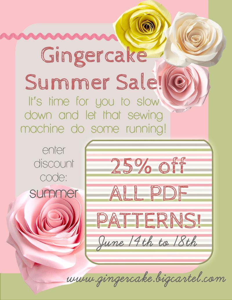
Yeah! A sale! I haven't done one in a while so here it is if you have been waiting to buy one of my patterns.
I have to admit I am pretty proud of this sales flyer. I had fun playing around with and probably spent WAY too much time but it did turn out the way I wanted it to look. If you are interested…
I made it using my photoshop elements. The color scheme is from this color card. I love using those color cards to design the colors schemes of my pages. Everything just comes together so nicely! The main scratchy type font is called cabin sketch. Love it! I also used Lane Humouresque and Learning Curve is the cursive looking one. I have a pinterest page I go through to get my inspiration going to make these title pages or flyers. As usual I use clip art from Pugly Pixel for my extras- like the roses, the ricrac, and the striped square. I used my PSE tools to really lighten up the roses to go with my colors better. Hope that bit of information helps someone who is trying to make their own designs! As always, I would love to hear what you have learned about making this type of stuff for your blog/ business. I need all the help I can get!
