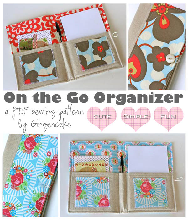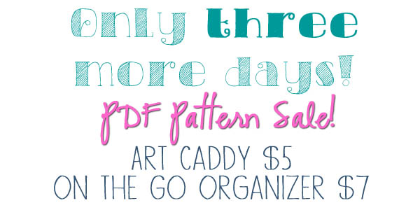
Although the sale is exciting, here on the blog we talk about other stuff too, right? I pinned this post from yellow bliss road and I used it to make my font combos above. Fonts are so fun! The sale flyer above is done in Photoshop Elements. Since I am not trained in graphic design or had any other graphics class, I didn't realize there were a couple rules of thumb when it comes to combining fonts. I used to just mess around forever trying to make it look right. The tips in that post are so simple and you will remember them forever when making up your own signage!
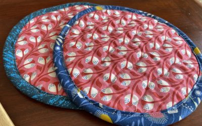
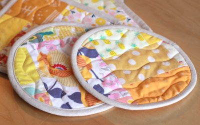
6 Steps to Sew a Beautiful Simple Circle Hot Pad
At some point in your sewing life, I'm sure you have tried to sew a hot pad/ pot holder. Something that looks so simple can be a frustrating project! Either you make it too thin and burn your hand or you try to make it too thick and it end up looking lumpy! How can...
